DDW Music Festival: Interactive Microsite and Campaign Assets
8-week client-based project

Description
A promotional concept for Dutch Design Week’s DDW Music Festival that combines a high-energy microsite with supporting campaign assets. Grounded in design research and cultural context, the experience uses strong content strategy, dynamic composition, and playful interactions to communicate the festival identity and guide visitors to discover artists and venues.
My Role
UX Designer · Interaction Designer · UI / Visual Designer · Content Strategy
Team
Context
DDW Music Festival is a nighttime event within Dutch Design Week. There was an opportunity to better communicate its distinct identity and make it easier for audiences to explore artists, venues, and activities.Core problem
Potential attendees need a fast, engaging way to understand the festival vibe and navigate key information (who’s performing, where it happens, what to explore) without friction or overload.Design goal
Create a coherent promotional system that balances emotional impact (atmosphere) with clarity (information hierarchy and wayfinding), aligned with the DDW brand spirit.Overview
We designed a cohesive promotional system consisting of an interaction-first microsite and supporting campaign assets (poster, billboard, and site placement concept). The solution integrates content strategy, UI/interaction design, and art direction to drive discovery while maintaining clear hierarchy.Content and experience strategy
Structure content so users can quickly answer: What’s the vibe? Who’s featured? Where do I go?
Use motion and interaction to encourage exploration while keeping navigation lightweight and readable.
Key microsite interactions
Atmosphere-first entry with a video-backed landing to communicate “night festival” instantly
Shuffle-based exploration to reduce choice overload and encourage discovery
Venue discovery map presented as a moving collage for fast visual context, with inner pages for details
Drag-and-drop audio interaction inspired by a record-player metaphor for playful music sampling
Browsable database + sorting so users can find activities by preference or location
Visual direction
A print-inspired aesthetic using halftone textures and cyan/magenta contrast to create dynamic composition and a bold nightlife identity, while preserving legibility and consistent UI hierarchy.Iteration
Design choices were refined through critique and evidence-based review, focusing on clarity of information hierarchy, interaction affordances, and brand coherence.Delivered a research informed promotional concept that unifies content strategy, interaction design, and art direction into a coherent DDW Music Festival identity while supporting fast comprehension and engaging discovery of artists and venues.
Key Experience Features
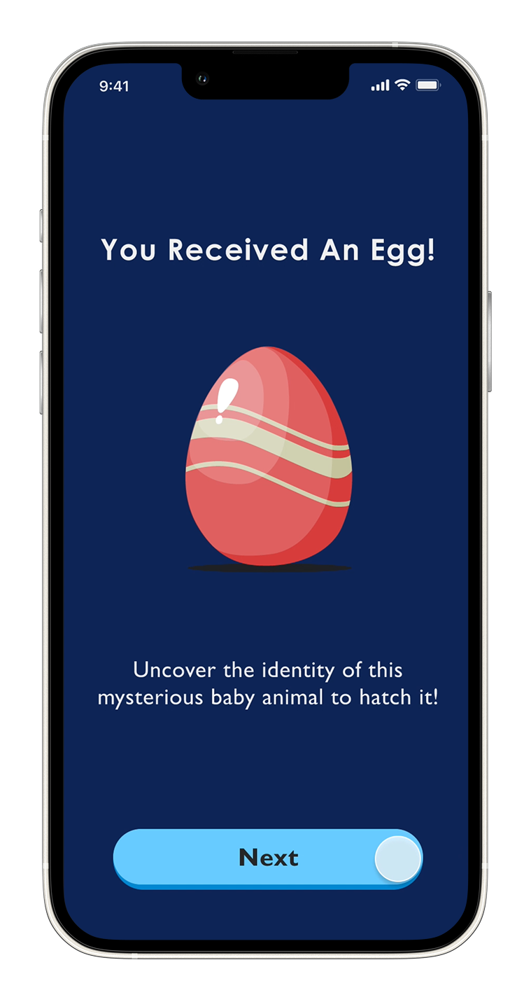
The intention behind presenting a gift is to captivate children, as a gift box imparts a sense of anticipation and positivity. In addition, assigning names to animals aids in expressing emotions, and helps establish a long-lasting connection with the Aquatic-Egg.

To elevate the visitor experience beyond the physical exhibits, we introduce various levels of difficulty at the start of the journey. Higher difficulty settings involve fewer displayed hints, introducing an additional layer of challenge and engagement. Notably, rarer eggs will exclusively hatch at higher difficulty levels.

We aim to introduce a 'Hatching Egg' micro-interaction for children, fostering lessons in compassion, nurturing, and understanding life cycles. The symbolic hatching of the aquatic egg emphasizes the significance of conservation in aquatic life, instilling these values in children.
This also evokes a sense of anticipation, encouraging visitors to reflect on the acquired information from the exhibits.

To elevate the entertainment experience at the Vancouver Aquarium, we incorporated a drawing feature in the experience. Our goal is to offer visitors the opportunity to craft and interact with their personalized unique sea creatures, which can then be showcased at the Teck Connection Gallery.
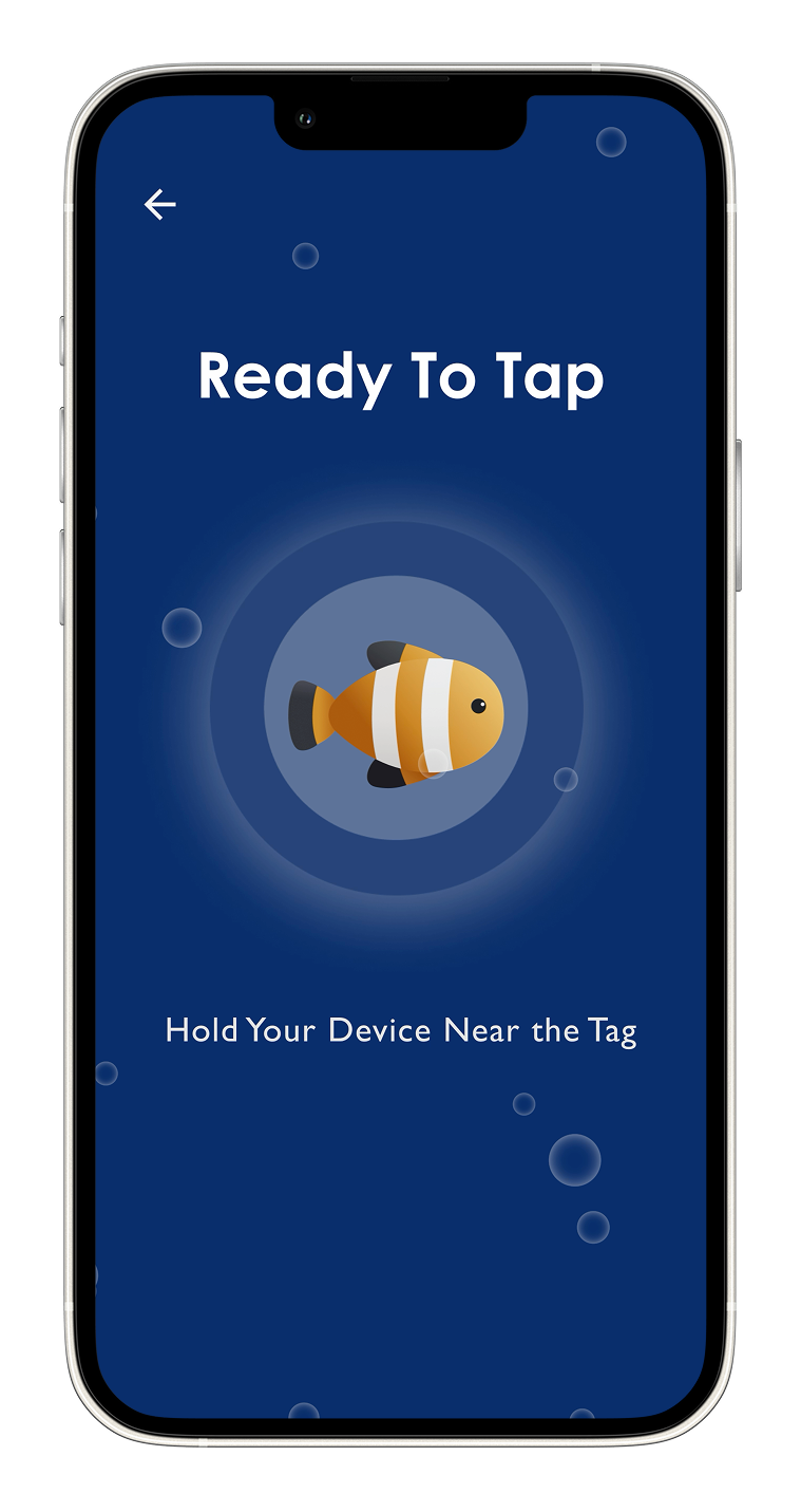
To release their custom sea animal design, visitors are required to hold their device near an NFC tag and project their work onto the Teck Connection Gallery. Every visitor who has participated in this journey can showcase their hatched sea animals.
The simulation of saving and releasing the animal to its habitat encourages empathy as children connect with the animal's needs, promoting a sense of responsibility for its safety and protection.

After visitors have released their hatched sea animal, these sea animals are projected onto the Teck Connection Gallery. This process seamlessly bridges the gap between the virtual and real worlds, allowing visitors to witness their animal come to life in its natural environment.

To enhance the visitor experience beyond the physical exhibits, visitors will receive a collectible card of the animal they hatched at the end of the journey.
Physical collectable cards will be printed for visitors which contains information about their hatched animal as well as a scannable qr code to entice visitors to continue their experience with the newly hatched aquatic animal.We want to offer all visitors the opportunity to take on the role of a responsible caregiver for the virtual aquatic animals they have previously ‘hatched’.
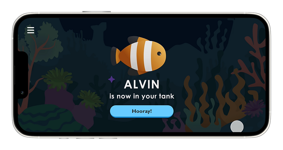
The Aqua Quest app serves as an extension of the visitor’s journey, allowing them to release the fish in the virtual fish tank, revisit their information including conservation value, attributes, habitat details, and acquire a collection handbook.