Up To Date: Medication Routine and History Tracker
6-week project

Description
A concept mobile experience that helps older adults follow medication routines with low memory burden. It prioritizes visual recognition, one tap confirmation, and a clear history view for reassurance, with optional future extensions such as scan based setup and caregiver sharing.
My Role
UX Designer · UI Designer · Interaction Designer
Team
Context
Older adults who take medication regularly often need to remember timing, dosage, and whether a dose was already taken. This becomes harder when multiple medications are involved.Core problem
Adherence is not only a reminder problem. Users also need a fast way to confirm what they took and review history when uncertain, without relying on memory or reading dense instructions.Key insights
Users do not trust memory and want reassurance through a simple history view.
Medication names are difficult to recognize, so visual cues reduce recall burden.
Typing and reading create friction, so actions and guidance should minimize text.
Design question
How might we reduce memory and reading burden while helping older adults complete doses on time and confidently verify medication history?Overview
Up To Date is designed around a repeatable daily loop. It supports two core jobs to be done: take the right medication at the right time, and confirm what was taken with minimal effort.Design principles
Visual first recognition over text heavy labels.
One tap confirmation over multi step logging.
History as reassurance, not as a report.End to end experience flow
Step 1 Setup medication
Users add medications with images and schedule details. Scan based setup is explored as a future extension.Step 2 Receive reminders
The interface focuses on the next action and reduces choice overload at the moment of reminder.Step 3 Confirm with one tap
Users mark a dose as taken quickly to reduce friction and increase completion consistency.Step 4 Review history for reassurance
A clear past current upcoming view helps users resolve uncertainty and supports better conversations with caregivers or clinicians.
MVP versus extensions
MVP focuses on reminders, visual recognition, one tap confirmation, and medication history.
Future extensions explore scan based medication setup, consult support, caregiver visibility, and a home display companion concept.Accessibility considerations
Large tap targets, high contrast, simple language, and reduced typing to support older adult usage.Proposed a medication adherence concept that reframes the problem as a daily behavior loop supported by visual cues, low friction confirmation, and a reassurance focused history view. The design defines a clear MVP scope and a realistic path for future ecosystem integrations.
Key Experience Features
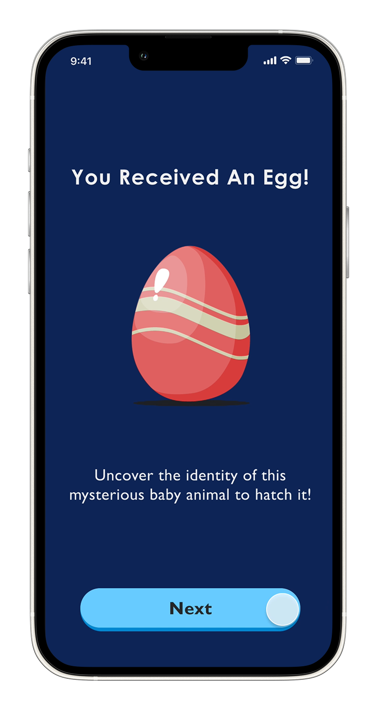
The intention behind presenting a gift is to captivate children, as a gift box imparts a sense of anticipation and positivity. In addition, assigning names to animals aids in expressing emotions, and helps establish a long-lasting connection with the Aquatic-Egg.

To elevate the visitor experience beyond the physical exhibits, we introduce various levels of difficulty at the start of the journey. Higher difficulty settings involve fewer displayed hints, introducing an additional layer of challenge and engagement. Notably, rarer eggs will exclusively hatch at higher difficulty levels.

We aim to introduce a 'Hatching Egg' micro-interaction for children, fostering lessons in compassion, nurturing, and understanding life cycles. The symbolic hatching of the aquatic egg emphasizes the significance of conservation in aquatic life, instilling these values in children.
This also evokes a sense of anticipation, encouraging visitors to reflect on the acquired information from the exhibits.

To elevate the entertainment experience at the Vancouver Aquarium, we incorporated a drawing feature in the experience. Our goal is to offer visitors the opportunity to craft and interact with their personalized unique sea creatures, which can then be showcased at the Teck Connection Gallery.
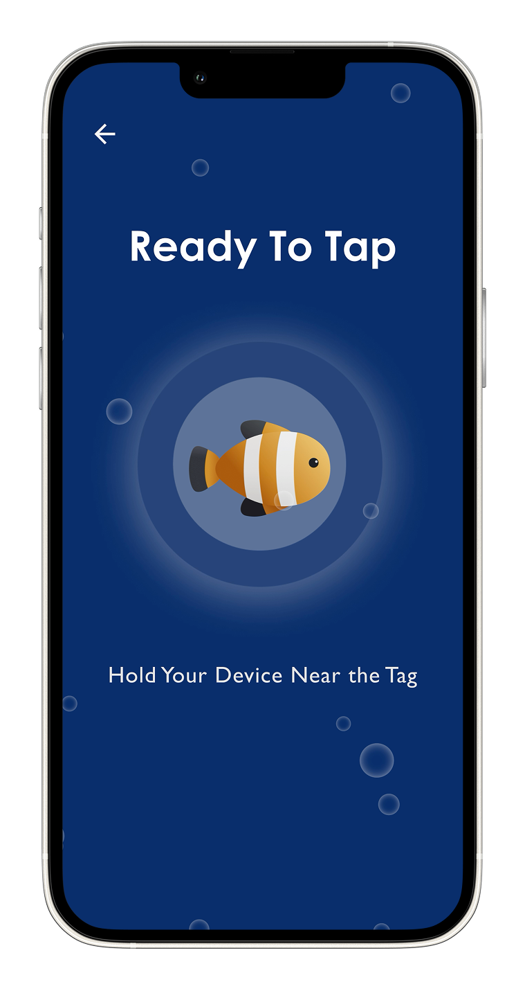
To release their custom sea animal design, visitors are required to hold their device near an NFC tag and project their work onto the Teck Connection Gallery. Every visitor who has participated in this journey can showcase their hatched sea animals.
The simulation of saving and releasing the animal to its habitat encourages empathy as children connect with the animal's needs, promoting a sense of responsibility for its safety and protection.

After visitors have released their hatched sea animal, these sea animals are projected onto the Teck Connection Gallery. This process seamlessly bridges the gap between the virtual and real worlds, allowing visitors to witness their animal come to life in its natural environment.

To enhance the visitor experience beyond the physical exhibits, visitors will receive a collectible card of the animal they hatched at the end of the journey.
Physical collectable cards will be printed for visitors which contains information about their hatched animal as well as a scannable qr code to entice visitors to continue their experience with the newly hatched aquatic animal.We want to offer all visitors the opportunity to take on the role of a responsible caregiver for the virtual aquatic animals they have previously ‘hatched’.
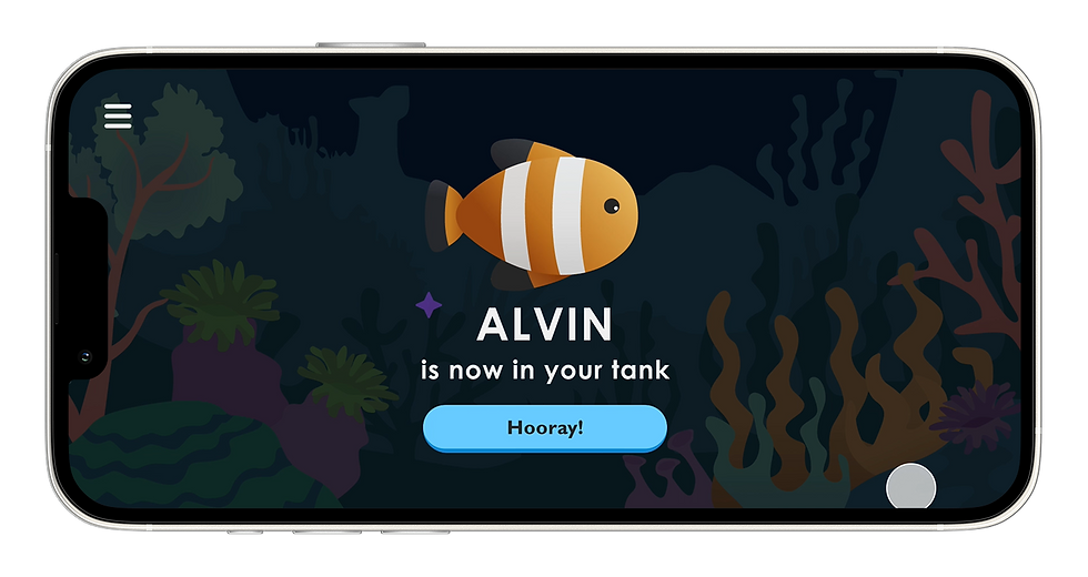
The Aqua Quest app serves as an extension of the visitor’s journey, allowing them to release the fish in the virtual fish tank, revisit their information including conservation value, attributes, habitat details, and acquire a collection handbook.